

You search “mental health tips graphic” on Pinterest or Google Images. You get 40,000 results. Most are pastel backgrounds with cursive fonts saying “breathe” or “you are enough.” They look nice. They get pinned. They don’t change anything.
Here’s the misconception most people hold: that a pretty graphic equals an effective graphic. It doesn’t. A mental health tips graphic works only if it reduces cognitive load during a moment when someone’s executive function is already compromised. Anxiety, depression, ADHD, burnout — these conditions make reading dense text harder, not easier. If your graphic requires 45 seconds of focused reading, you’ve already lost the person who needs it most.
This article breaks down what actually works, based on how the brain processes visual information under stress. No affiliate links. No product pitches. Just design logic you can apply in Canva, Adobe Express, or even Google Slides.
What Mental Health Graphics Are Actually For
The first principle here: a mental health tips graphic is not decoration. It’s a cognitive offloading tool. That’s the term from cognitive psychology. When someone is spiraling, their working memory is full. They cannot hold “what should I do right now” in their head while also feeling panic. The graphic has to hold that information for them.
This is why the National Institute of Mental Health (NIMH) uses structured, low-text infographics for crisis resources. Their “5 Action Steps for Helping Someone in Emotional Pain” graphic uses numbered boxes, not paragraphs. Each step is under 10 words. That’s not a style choice. It’s a functional requirement.
The 3-Second Rule
A mental health graphic should communicate its core message in under 3 seconds. Not because people are lazy. Because someone in distress has a narrowed attentional field. Research on stress and visual processing shows that acute stress reduces peripheral attention and increases fixation on threat-related stimuli. If your graphic is visually busy, the stressed brain skips it entirely.
What Most Creators Get Wrong
The most common failure mode: cramming 12 tips into one graphic. You see this everywhere — “101 Self-Care Ideas” with 10pt font. The creator thinks they’re providing value. They’re actually providing a wall of text that feels like another demand. The person who needs the graphic now has to parse 12 items, decide which applies, and remember it. That’s more cognitive load, not less.
Another failure: using abstract affirmations without action. “You are worthy” is nice. “You are worthy — call your sister at 3pm” is usable. The first is a sentiment. The second is a behavior. Mental health improves through behaviors, not sentiments.
5 Graphic Formats That Reduce Cognitive Load

Here’s my position, and I’ll defend it with specifics: the best mental health tips graphics are single-action, high-contrast, and printable. Not multi-tip carousels. Not aesthetic quote posts. Here are the five formats that meet that standard.
1. The Single-Action Card
One graphic. One action. That’s it. Example: a card that says “Drink a glass of cold water. Hold it with both hands. Feel the temperature for 30 seconds.” That’s a grounding exercise from dialectical behavior therapy (DBT), and it works because it gives the brain a specific sensory task. Therapist Aid has a whole library of these — their “Grounding Techniques” card is a good reference. The format: white background, one dark-colored box, 3 sentences maximum.
2. The Flowchart
Flowcharts work because they externalize decision-making. “Do I feel anxious? → Yes → Is my heart racing? → Yes → Do 4-7-8 breathing for 2 minutes.” The person doesn’t have to generate options. They just follow the arrow. Mental Health America uses this format in their “Feeling Overwhelmed?” resource. The key spec: no more than 4 decision points. Beyond that, the chart becomes a puzzle.
3. The Body Map
This is underused. A simple outline of a human body with arrows pointing to physical locations: “Shoulders tight? Roll them 5 times.” “Jaw clenched? Open your mouth wide, then release.” The body map works because it bypasses verbal processing entirely. You feel the tension in your shoulders, you see the shoulder on the graphic, you do the action. No translating words into body awareness. This format is especially effective for somatic anxiety symptoms.
4. The Time-Block Visual
For people with depression or executive dysfunction, time becomes abstract. “Do something you enjoy” is useless when you can’t remember what you enjoy or how long anything takes. A time-block visual shows: “10:00–10:05: Open the blinds. 10:05–10:10: Make toast. 10:10–10:15: Eat the toast near the window.” Each block has one action. The graphic does the planning so the person doesn’t have to.
5. The Contrast Card
This format shows a thought and a factual alternative side by side. Left side: “I can’t handle this.” Right side: “I’ve handled difficult things before. This is difficult, not impossible.” It’s a cognitive restructuring tool from CBT. The visual contrast matters — the two sides should be visually distinct (different background colors or a clear dividing line). The brain processes the contrast faster than it would process the same content in paragraph form.
Format Comparison Table
If you’re choosing a format for a specific audience or setting, this table cuts through the noise. It’s based on the cognitive demands of each format and where each one performs best.
| Format | Cognitive Load | Best Use Case | Worst Use Case | Recommended Text Length |
|---|---|---|---|---|
| Single-Action Card | Very low | Acute distress, crisis moments | Long-term habit building | Under 30 words |
| Flowchart | Low to medium | Decision paralysis, anxiety | Grief support | Under 60 words |
| Body Map | Very low | Somatic anxiety, panic | Abstract emotional processing | Under 20 words |
| Time-Block Visual | Medium | Depression, ADHD, executive dysfunction | Acute crisis | Under 50 words |
| Contrast Card | Medium | Cognitive distortions, rumination | Immediate physical danger | Under 40 words |
The pattern is obvious: the most effective formats are the shortest. If your graphic has more than 60 words, you’re writing an article, not a graphic.
Design Specs That Actually Matter

Most design advice for mental health graphics focuses on aesthetics: color palettes, font pairings, “calming” imagery. That’s backwards. The specs that matter are the ones that affect readability under stress.
Font Size and Contrast
Minimum 18pt for body text. Minimum 24pt for the main message. This is not negotiable. Someone squinting at their phone during a panic attack cannot read 12pt text. High contrast: dark text on light background or light text on dark background. Avoid mid-tone backgrounds with mid-tone text. The contrast ratio should be at least 4.5:1, which is the Web Content Accessibility Guidelines (WCAG) AA standard. Canva has a built-in contrast checker, but it only works on Pro accounts. The free alternative: take a screenshot, convert to grayscale, and see if the text still stands out.
One Graphic, One Message
I said this earlier, but it bears repeating because it’s the most violated rule. If you’re making a carousel for Instagram, each slide is its own graphic. Slide 1: one tip. Slide 2: another tip. Not slide 1: five tips crammed together. The carousel format works because each swipe is a fresh visual. Use that.
Printability
The best mental health graphics are printable. A therapist can hand them to a client. A person can tape one to their bathroom mirror. This means: no dark backgrounds that eat printer ink, no tiny text that blurs when printed, no QR codes that are useless on paper. The Therapist Aid worksheets and graphics are consistently printable, which is why they’re so widely used in clinical settings.
When NOT to Use a Graphic
This is the section most articles skip. A mental health graphic is not the right tool for every situation. Sometimes it’s the wrong tool.
Do not use a graphic as a substitute for professional help. A graphic that says “you are not alone” does not replace a crisis counselor. If someone is in immediate danger, the graphic should point them to a phone number or text line — the 988 Suicide & Crisis Lifeline in the US, for example. The graphic itself cannot provide safety.
Do not use a graphic for complex psychoeducation. Explaining the difference between generalized anxiety disorder and panic disorder requires more nuance than a graphic can hold. That’s what articles, books, and therapy sessions are for. A graphic can summarize a concept after someone has learned it. It cannot teach the concept from scratch.
Do not use a graphic when the audience is unknown. A graphic made for teenagers with anxiety looks different from one made for veterans with PTSD. Different language, different cultural references, different visual metaphors. If you don’t know who you’re designing for, the graphic will be generic, and generic graphics don’t work.
Where to Find and Make Effective Mental Health Graphics
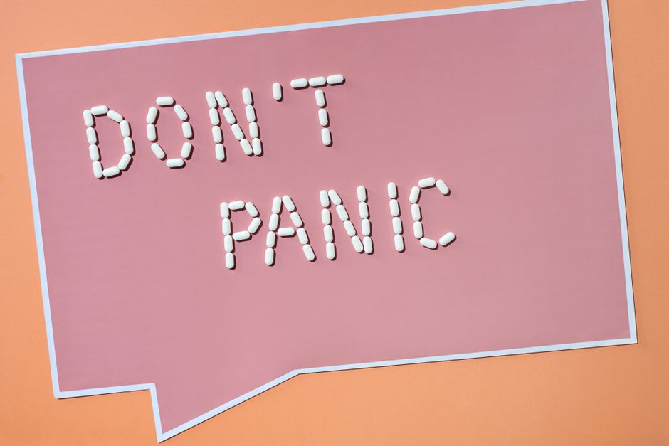
You have three options: use existing graphics from reputable sources, make your own, or work with a designer. Here’s the breakdown.
Reputable Free Sources
- Therapist Aid — free, printable, clinically reviewed. Their grounding techniques and cognitive distortions graphics are the gold standard.
- Mental Health America — free infographics on specific conditions and coping skills. Good for sharing in workplaces and schools.
- NIMH (National Institute of Mental Health) — free, research-backed graphics. More text-heavy than the others, but accurate.
Making Your Own in Canva or Adobe Express
Both tools have mental health templates, but most of them are the pastel-quote type I warned about earlier. Start from a blank 1080×1080 canvas instead. Use the specs from this article: one action, under 30 words, 18pt minimum font, high contrast. If you’re making a series, keep the same layout and swap the content. Consistency builds recognition.
When to Hire a Designer
If you’re a therapist, clinic, or organization creating graphics for clients, a designer with accessibility training is worth the cost. The difference between an amateur graphic and a professional one is not aesthetics. It’s whether the graphic actually gets used. A designer who understands cognitive load will make different choices than one who only knows color theory. Expect to pay $50–$150 per graphic for quality work in 2026.
My recommendation: if you’re creating graphics for your own use, start with Therapist Aid’s free resources. They’re already tested. If you’re creating for an organization, hire a designer who can show you examples of accessible, low-cognitive-load work. Don’t pay for pretty. Pay for usable.
Medical Disclaimer: This content is for informational purposes only and does not constitute medical advice. Always consult a qualified healthcare professional before making health-related decisions.